Nature's life
Radical Wellness
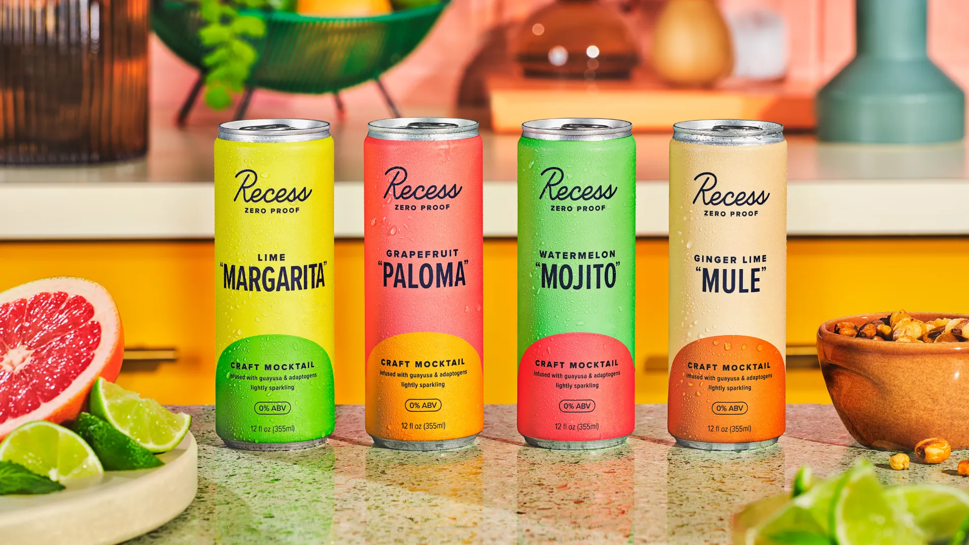
Services
Brand Strategy
Design Strategy
Tone of Voice
Visual Identity
Brand Style Guide
Nature’s Life, the legacy supplement brand founded in 1975, has come a long way. They approached us as they were being perceived as a legacy brand with outdated assets—regardless of their loyal customer base and wide range of highly efficacious products. Ultimately, the goal was to revitalize their brand while preserving their rich history. Our task was to rejuvenate their brand, aligning it with their commitment to quality and sustainability, including their One Tree Planted Initiative, ensuring that Nature’s Life continues to stand out in the highly competitive supplement market.


Our strategic approach aims to bridge the gap between our rebellious roots and a fresh audience while maintaining our loyal customer base. By tapping into 70s culture and environmental concerns, we advocate for nature, appealing to "The Naturalist" - individuals focused on cleaner living and positive change for themselves and the planet. Our goal is to empower them with natural nutrition solutions.


We embraced Nature's Life's 70s West Coast vibe and timeless values, captivating both loyalists and new customers. The design elements pay homage to the brand's rich history and rebellious roots, featuring the iconic sun logo with a woodgrain texture and an authentic serif logomark by Rob Clarke. The type system, using Relative and Sailec fonts, blends classic and contemporary appeal. The refreshed color palette, including Sunshine (Yellow) and Sky (Blue), maintains brand identity while offering flexibility for flavor-specific products. Our design seamlessly combines nostalgia and modernity, embodying Nature's Life's enduring grooviness.

Other Work

going banana's with a classic frozen treat
Diana's