Stem ciders
branding better-for-you cider
Services
Brand Strategy
Brand Narrative
Product Naming
Design Strategy
Visual Identity
Package Design
Campaign Assets
Tone of Voice & Marketing Messaging
When Stem Ciders came to Interact for a brand refresh, they had outgrown their humble beginnings as a Cider company that works with natural ingredients. Over the years, they had become a brand that is about reimagining the possibilities of Cider. They were doing things with flavor, in a low-sugar offering, that no one else in the industry was doing. But this was not reflected in their brand identity or brand ethos.
It came time to take stock of the amazing things they do, and better reflect those things back to their consumers.
Stem Ciders makes great ciders in unique flavors. And they do it with less sugar which sets them apart from their competitors and gives them an opportunity to become a category leader, and product definer.
Our challenge was to reeducate consumers on what cider can be – to help challenge the category and set Stem apart. Stem Cider is all about more sophistication and exploration of flavor, using less sugar. Better, and better for you.
It was then our goal to expand consumers' definition of cider and become the leader known for pushing the flavor envelope.
Stem Ciders exists to Explore Endlessly based on Stem’s exploratory flavors and fearless innovation along with innovation along with being a high quality natural product.


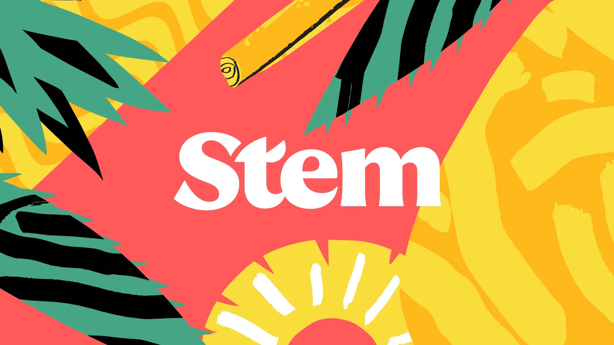
Stem Ciders is grounded in history and tradition. We wanted to exude the handcrafted nature of the product itself in our typography from Greg Lindy. Our brand mark is simple, strong and traditional. We add in a bit of playfulness and delight with elements like the T in Stem which is meant to evoke a leaf.
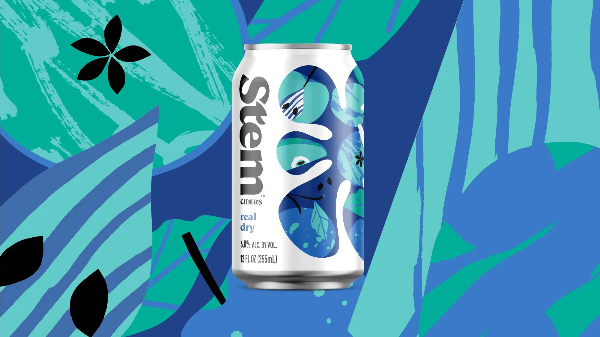
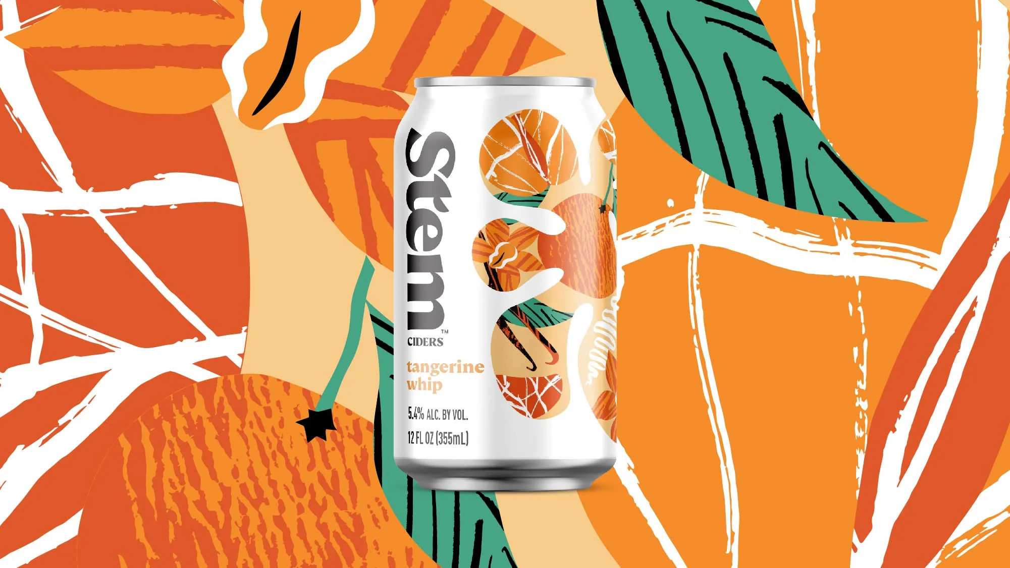
Additionally, our illustrations by Tom Abbiss Smith and packaging design showcase our playfulness and fearlessness. A simple, streamlined can design speaks to the clean, sophisticated nature of the products.
The central blob featured on cans, – we’ve aptly named it “Blobby” -- serves as a window into the world of flavor. This is our “window” in a natural liquid shape showcasing the ingredients of each which helps tell that product's story.


As part of the brand refresh, we touched all messaging from flavor note indicators to big brand headlines. Messaging was intended to speak to “the world explorer” archetype - like the Ciders, messaging exudes the lighthearted maverick in all our language.

Other Work

Rebranding a billion dollar business
Hot Pockets