Widmer Brothers
Remaking history with a craft brew icon

Services
Brand Strategy
Branding
Packaging
Illustration
Widmer Brothers Brewing is core to the macro-craft beer world. The two brothers entered the scene in 1984 with nothing more than a truck and skills in German brewing. From there they crafted Hefe American Hefeweizen – their celebrated flagship beer. With momentum on their side they developed new flavors and increased distribution. They were gaining traction, but in order to keep up with demand, the cohesiveness of their branding fell by the wayside. That’s why we came in. In creating a unified design system that articulates the history of the brand and the brewery as the cool, laid back guys that started it and the people who drink it, we carved a space for Widmer Brothers that’s uniquely theirs.


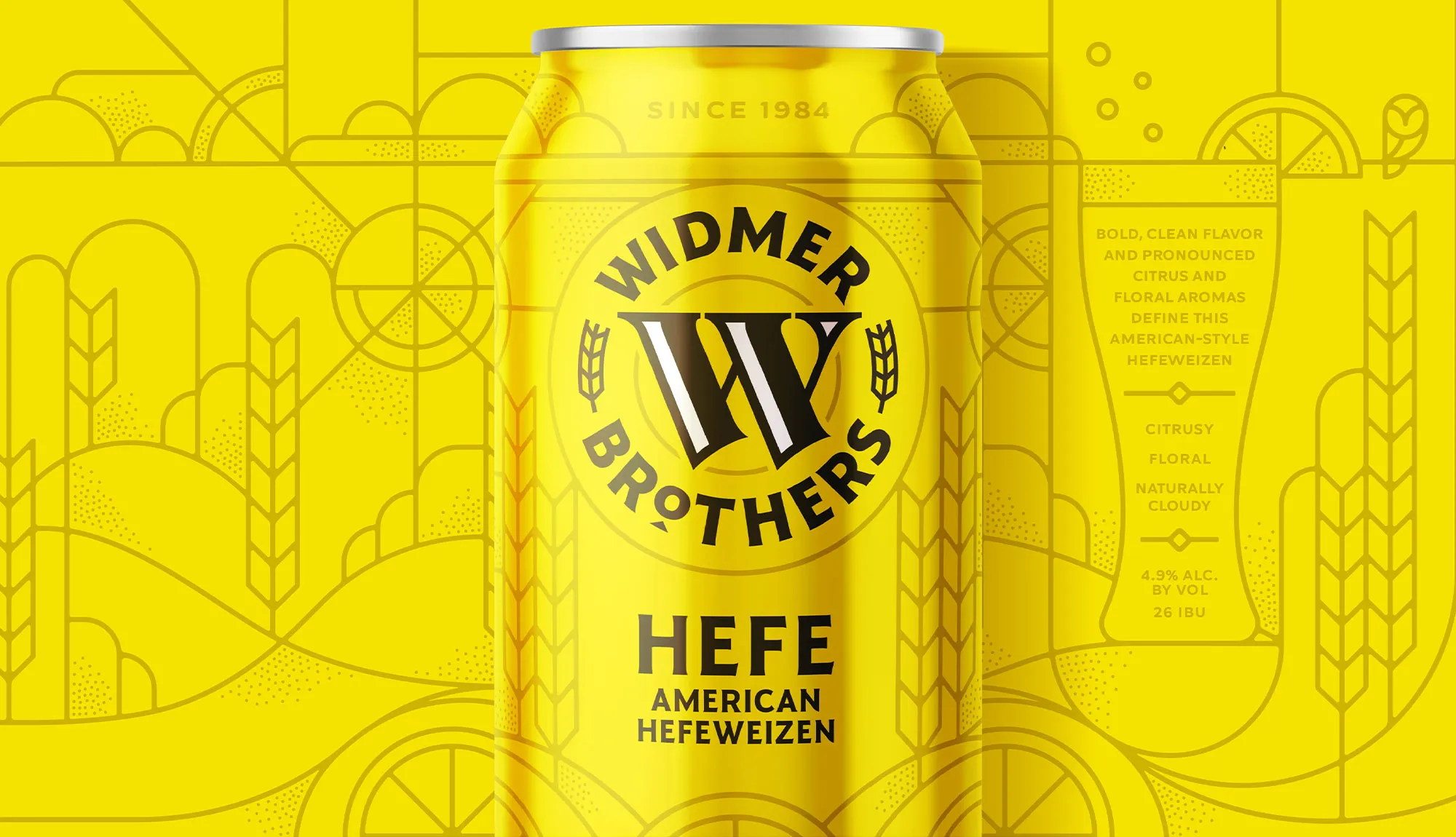


We sought to entirely revitalize Widmer Brothers Brewing. As an established brand with loyal customers, the challenge we faced was to attract a new demographic and get more beer in people’s hands. Customers already in love with Widmer Brothers Brewing seemed to have a lot in common. We deemed them: ‘The Laidback Crafters.’ They’re the type that seek out consistently crushable beers they can rely on. When we considered the type, we envisioned golden hour on the back porch in a flannel and jeans any day of the week – a moment of relaxation, relief, and hominess. The Widmer Brothers founding story reaffirms the belief that this experience is one most people search for and one they can provide.


We knew we had to remake Widmer into a brand that represented important elements of its past, while modernizing it for the future. We had to create a beer made truly for easy back-porch moments that would connect our laid-back crafters to the history of the brewery and the unique flavor profiles of the brews. We re-imagined every aspect of the brand. We redrew and recrafted the iconic ‘W’ mark to have a modern and iconic edge in harmony with their original heritage feel. We centered the new mark in a branded badge that would unite the packaging and pop on shelf. We took inspiration from the stained glass windows in their original brewery to create an illustration style distinct to each flavor in hopes that customers begin to recognize and tie a story to their favorite beer. Altogether, we redesigned the brand to be one that anyone would be proud to hold in their hand, raise a glass to, and cheers.


Other Work

Building a better-for-you cider
Stem Ciders